


I’ve been experimenting with CSS Animations recently. One aspect of animation that I had a difficult time grasping was the @keyframes syntax. While I understood @keyframes as stops or points in the lifecycle of the animation, it was difficult to translate what I visualized into workable code.
While coding an animation to help with focus breathing exercises, I decided to sketch out what animation changed I wanted, before coding. I wanted to see if this approach would work better than trying offsets and hoping for the best.
In this post, I’ll outline how I visualized my idea for animation and broke it into smaller steps that would be coded as steps in the animation.
Focused Breathing
Before I get into coding or drawing out any ideas, it was helpful to me to write down high-level steps of what I wanted my animation to be. I was basing my animation on a 4-second breathing technique I recently, learned, which goes like this
- Inhale through the nose
- Hold the breath
- Exhale through the mouth for 4 seconds
The amount of time to inhale or hold the breath may not matter, but to make it easier for this project, 2 seconds to inhale and 2 seconds to hold a breath seemed reasonable.
For the animation it’s self, I visualized a circle that would expand, cueing you inhale and contract when it was time to exhale.
Visualizing the Animation
With @keyframes the stops or offsets range between 0% and 100%. The beginning or start of the animation would be 0% stop and the end would be 100%. Or, any number in between.
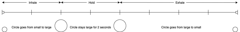
It makes sense to map out what I wanted to happen like a timeline. A line segment with two endpoints could represent our timeline. And, to make it a bit easier on ourselves, let’s divide the line into 8 even parts (1 part for each second of the animation).

And labels for which sections represent inhaling, holding a breath and exhaling.

And some quick representations and notes on what the circle should look like at each step on the timeline.
Now that we have drawn out what we want our animation to look like, we are almost ready to start coding.
Translating the Timeline to @keyframes
Looking at the timeline, it may look like we need 8 or 4 steps in the animation, but this is not the case. Each offset point in a @keyframe animation is a point where properties can be changed from their original values.
The circle starts small, then it’s changed to be larger than it was originally, then it holds that size, then it shrinks down to the size it was originally and the animation starts over. The @keyframe only needs 2 offset points (at the 25% and 50% marks) and the original styling of the circle handles the starting (and ending) visuals.
Here’s the CSS for my circle (div) as a reference.
div {
    background-color: lightsteelblue;
    width: 10px;
    height: 10px;
    border-radius: 5px;
}
Which looks like this.

That’s a small, light purple circle.
To apply @keyframes to that circle, we use the animation property, which takes in multiple values including breath which is we’ll call our @keyframe animation.
div{
    background-color: lightsteelblue;
    width: 10px;
    height: 10px;
    border-radius: 5px;
    animation: breath 8s ease infinite none running;
}
Now we can write the code for our @keyframes. The format is like this
@keyframes nameofanimation {
 offset {
    property: value;
 }
}
Multiple properties can be changed and multiple offsets can be set at one time. For our animation, we can group the changes to the size of the circle together in one offset declaration in our @keyframe
@keyframes breath {
 25%, 50% {
    background-color: lightpink;
    width: 200px;
    height: 200px;
    border-radius: 100px;
 }
}
At the 25% and 50% points in the animation, the circle will look like this.
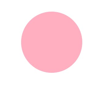
That’s a much larger, light pink circle.
Going back to the animation: breath 8s ease infinite none running; property we added, 8s is how long the animation (from 0% to 100%) will run. So, 25% would be 2 seconds, in, 50% would be 4 seconds in and so forth.
Putting everything together, here’s what our animation looks like.
Conclusion
Going back to my idea that sketching each step of the animation before coding, did save me a lot of time and trial and error when came to writing the code for the @keyframe. As I experiment with more complex animations, jotting it down on paper first will help me to clarify my thoughts and work through any conflicts. Overall, it took one correction before I got the effect I wanted. This process reminded me of pseudo coding which is something I had gotten out of the habit of doing lately.